• Raphael Murray Browne

    Student Product Design 3rd Year University of Plymouth, UK

    Messages sent without an email address are one-way and anonymous.

    I want objects to have presence: to respond to their users through motion, voice, or something else entirely.

    I love the way renders make me feel. I want to bring their uncanny sanitisation to the real world.

    Each project teaches me a new tool, practice, or material.

    Message me in the box above, or email raphael.murraybrowne@gmail.com

  • I want objects to have presence: to respond to their users through motion, voice, or something else entirely.

    I love the way renders make me feel. I want to bring their uncanny sanitisation to the real world.

    Each project teaches me a new tool, practice, or material.

    Message me in the box above, or email raphael.murraybrowne@gmail.com

Raphael Murray-BrowneRaphael Murray-BrowneRaphael Murray-BrowneRaphael Murray-BrowneRaphael Murray-BrowneRaphael Murray-BrowneRaphael Murray-BrowneRaphael Murray-BrowneRaphael Murray-BrowneRaphael Murray-BrowneRaphael Murray-BrowneRaphael Murray-BrowneRaphael Murray-BrowneRaphael Murray-Browne

Acrylic Sandwich Lamps

A batch-production lighting study — translucent acrylic layered and lit from within, then re-made in Corian, wood and metal to see how each material looks, feels, and responds to the light.

Acrylic sandwich lamps were the result of a university project requiring 10 products to be made with optimisation for batch production with the aim of selling them at the Bovey Tracey Craft Fair.

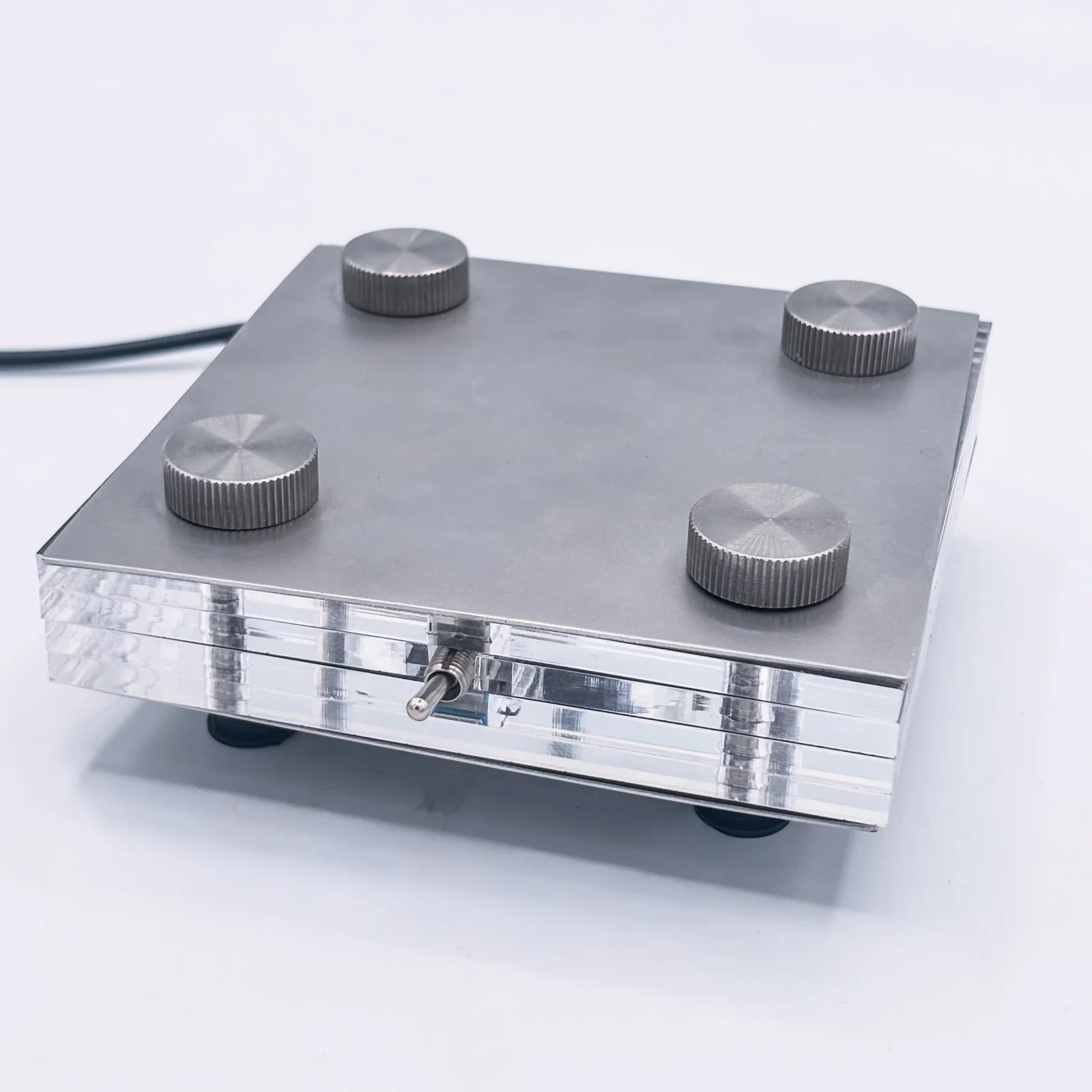
The lamps were made from layers of 5mm clear acrylic as the “filling” of the sandwich, and then a variety of materials made up the “bread”. The materials in question were:

  • Larch
  • Ash
  • Stainless Steel (304)
  • Corian
  • Laserply

with varying aesthetics and success.

With the simple geometric forms, any inaccuracies were amplified, and so I decided to slightly round the corners to make any misalignment less obvious. The materials were laser cut or CNC milled to minimise variation.

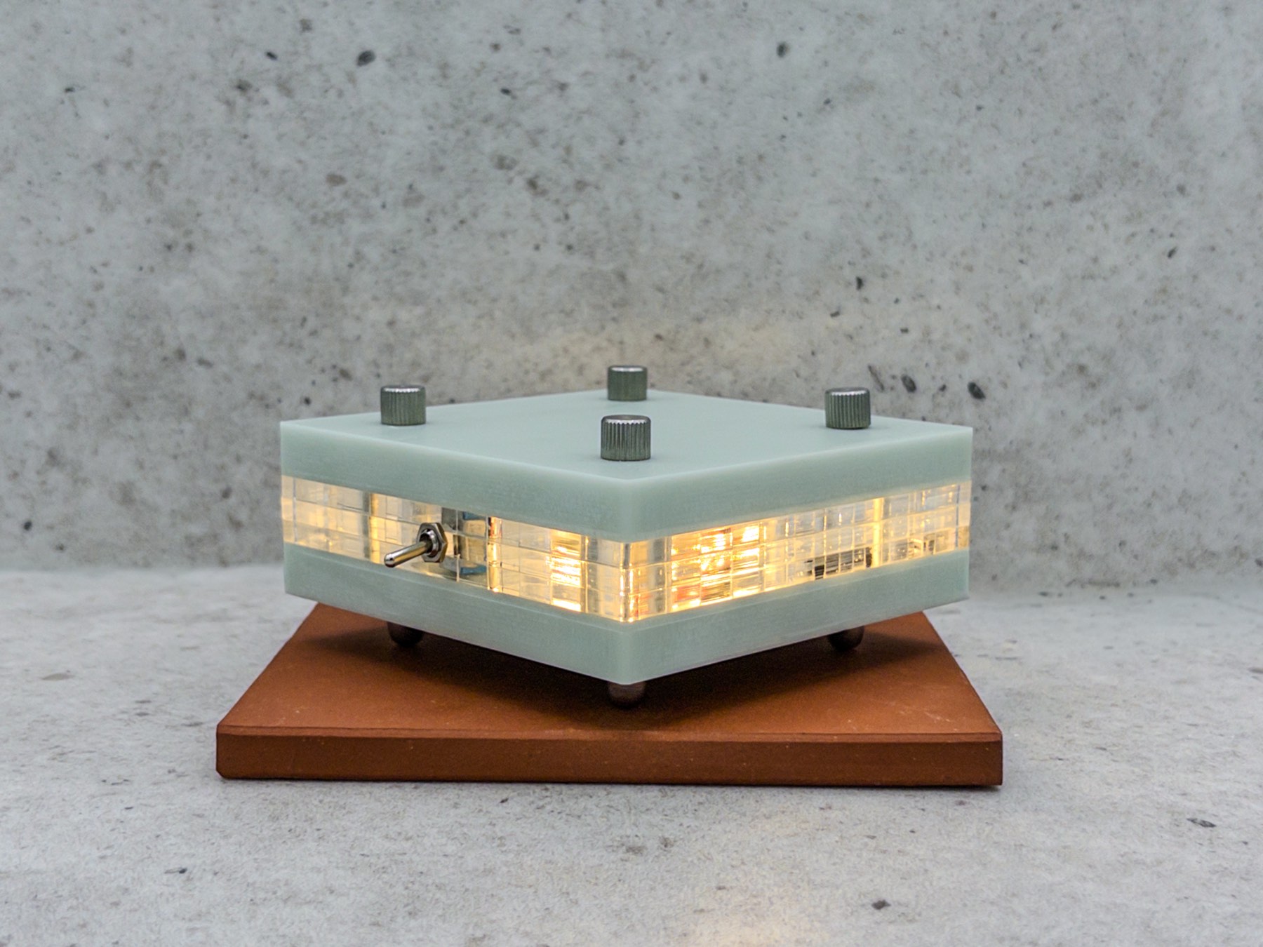
The Corian lamp, lit from within

Corian is a synthetic stone-like material that comes in a variety of colours. It has a subtle translucency that softens its edges to the eye. While usually used in countertops, Corian has been used here for its cool touch, unusual aesthetic, and weight.

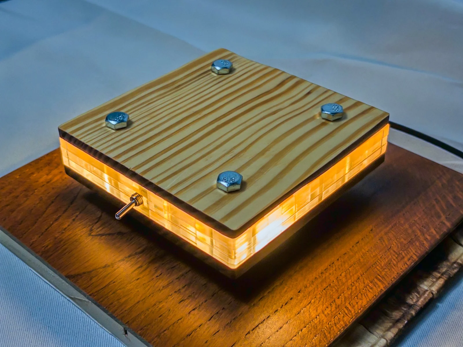
I reclaimed some larch from a previous project and laser cut it into shape before using Danish oil on it to seal the burn marks, a technique I was not aware of before experimentation. The orange hues of the wood give the internal light warmer reflections.

The wooden (larch) lamp, lit from within
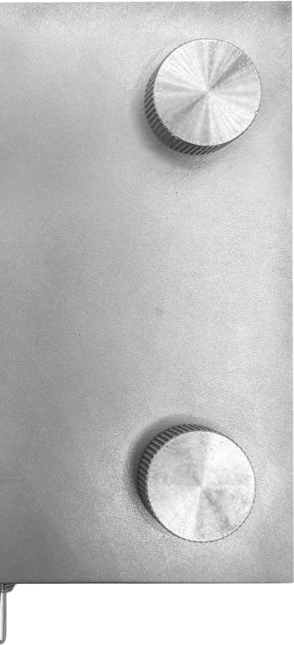
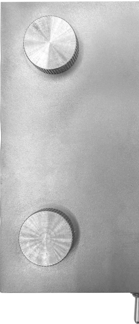
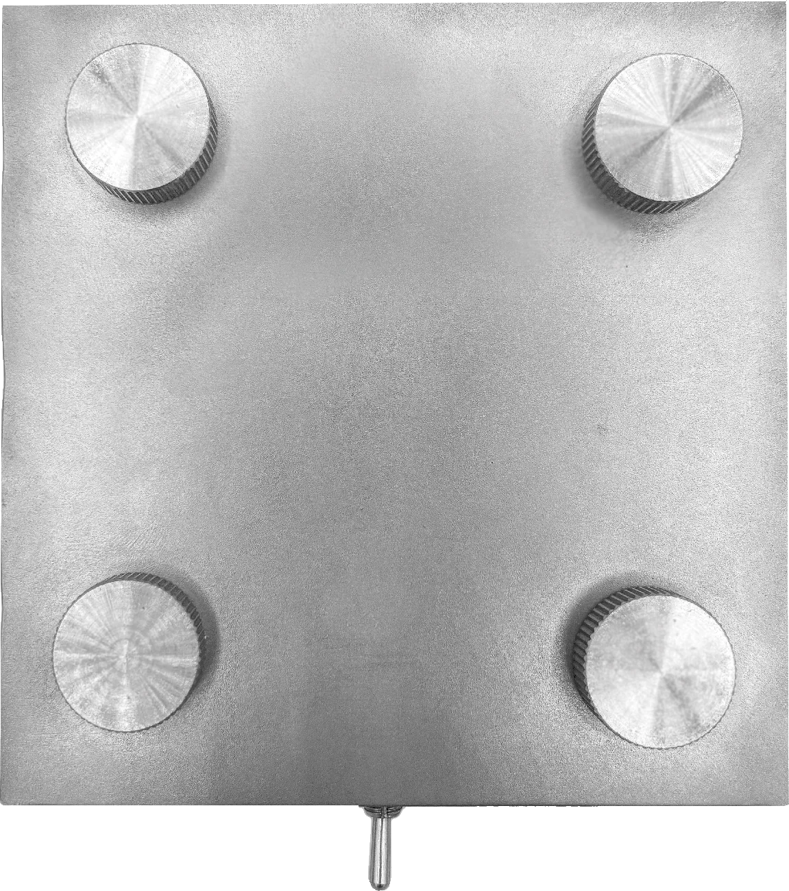
The stainless steel lamp
The metal was originally my favourite because it deviated so far from what the university resources shaped as “normal”, while still feeling premium and luxurious. The stainless steel gives a cold touch while feeling sturdy and expensive, reminiscent of high-end hi-fi equipment.
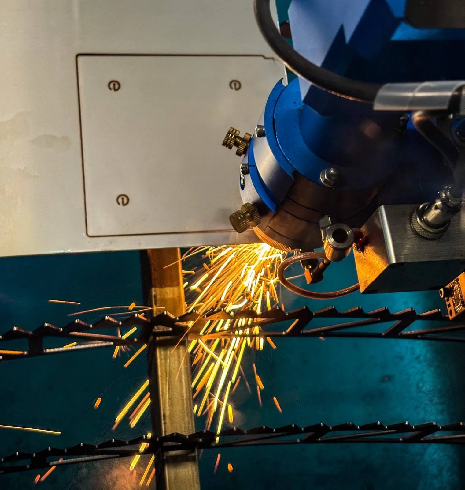
Laser-cutting the stainless steel
An initial prototype testing out the feasibility as well as the attractiveness of stainless steel. The strip was manually drilled with no jig hence any misalignment. All metals, woods, and acrylics used in this project were laser cut, allowing for high accuracy between layers and consistency among units.
A large part of this project was working around costings. For this, I learnt how to use Microsoft Excel, creating a large spreadsheet capable of taking word material inputs at “stainless steel” and outputting a calculated price using a lookup table. The spreadsheet also took into account the variations in labour costs for each combination of materials.
The stainless steel lamp, cut out The stainless steel lamp, cut out
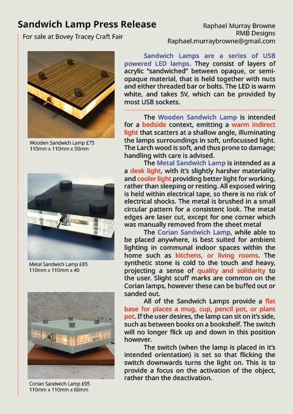
The single-page press release
I created a press release, using dense text to convey an exact intention on the single A4 side, while colouring important words in red and blue, allowing people to scan through the document quickly. The press release was instrumental in understanding the identity of the lamps, and the context in which I envisioned they would reside. The warmer hues of the wooden lamp suited a night light, whereas the cooler lights from the metal and Corian lamps suited a desk, or kitchen, or bookshelf.
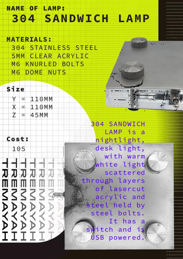
'304 Sandwich Lamp' spec poster
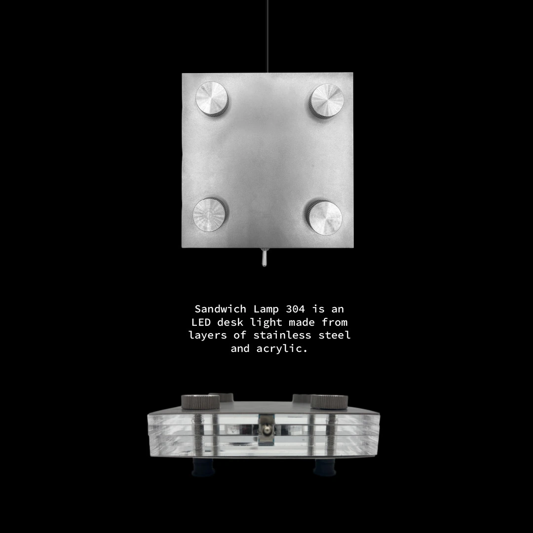
Dark 'Sandwich Lamp 304' poster Y2K checkered sandwich lamp poster

I made a series of posters and instagram posts for online presence. This was originally because I didn’t know what a press release is, and thought it meant just a kind of online presence. The Y2K poster for my metal lamp is inspired by the colour palette and artstyle from the videogame Marathon, which released in 2026 and has been my latest graphical obsession.

Raphael Murray-BrowneRaphael Murray-BrowneRaphael Murray-BrowneRaphael Murray-BrowneRaphael Murray-BrowneRaphael Murray-BrowneRaphael Murray-BrowneRaphael Murray-BrowneRaphael Murray-BrowneRaphael Murray-BrowneRaphael Murray-BrowneRaphael Murray-BrowneRaphael Murray-BrowneRaphael Murray-Browne

Porcelain Keycaps

Using the keycap as a medium to put materiality first — and casting a set in clear-glazed porcelain.

Moving into second year, I wanted to raise the standard of my work considerably — to stop coasting and find the real limits of what I could make. Keycaps became the vehicle for that: small, exacting objects with an enthusiast community that obsesses over feel, sound, ergonomics and look. Part of the motivation was selfish — I wanted beautiful keycaps myself, without paying the premium that the few makers in this space charge.

By using the keycap as a medium, I could put materiality in the foreground, treating the investigation of different materials as the whole point of the product rather than an afterthought. I drew up a set of material ambitions to chase: metal — brass, coated copper, steel, even gold; ceramic — glossy or matte, with a huge tactile range; Jesmonite — an inexpensive, eco-friendly entry point; wood — rarely seen, because of the intricate cutting a keycap demands; and glass — ambitious, but a keyboard like rows of tiny glass blocks could be one of a kind.

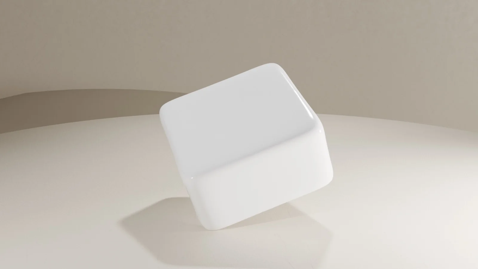
CAD render of the keycap — a rounded cube with a dished top
Before any casting, the keycap itself needed designing. I modelled it in Rhino as a rounded cube with a dished top for the finger — my own shape rather than a standard profile, while keeping the hollow underside a switch stem needs.

I gathered the research into a material taxonomy laid out as a magazine in InDesign — far less technical than my first attempt, much nicer to look at, and far more time-consuming to make.

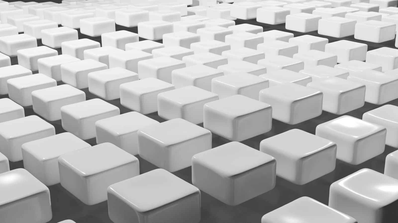
A render of a whole set of the porcelain keycaps

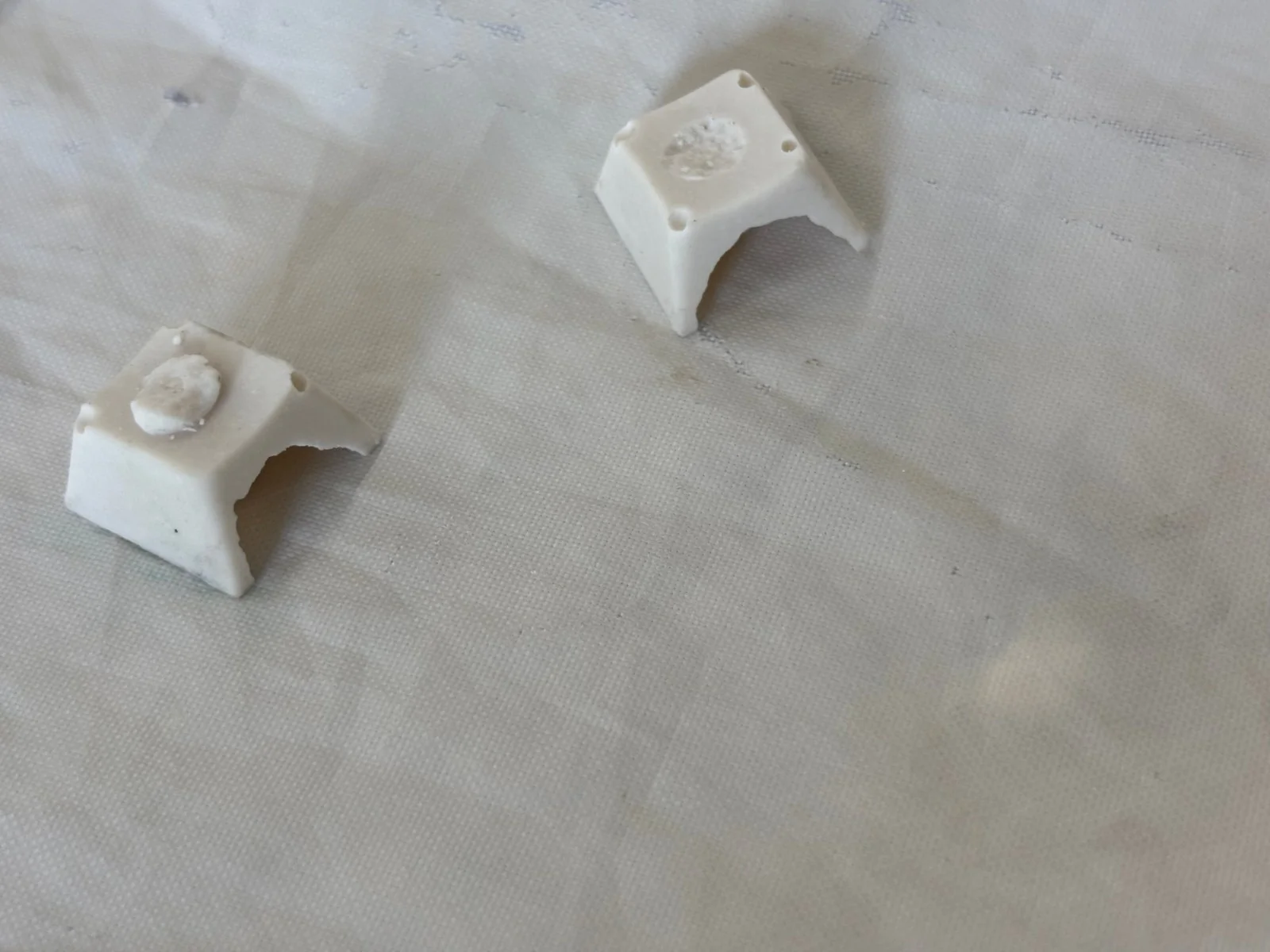
The main build focused on ceramic, and specifically on the problems of casting porcelain, clear-glazed keycaps. I cut a two-part mould and worked through the casting process, drying the pieces in a hot cupboard before firing them in a kiln.

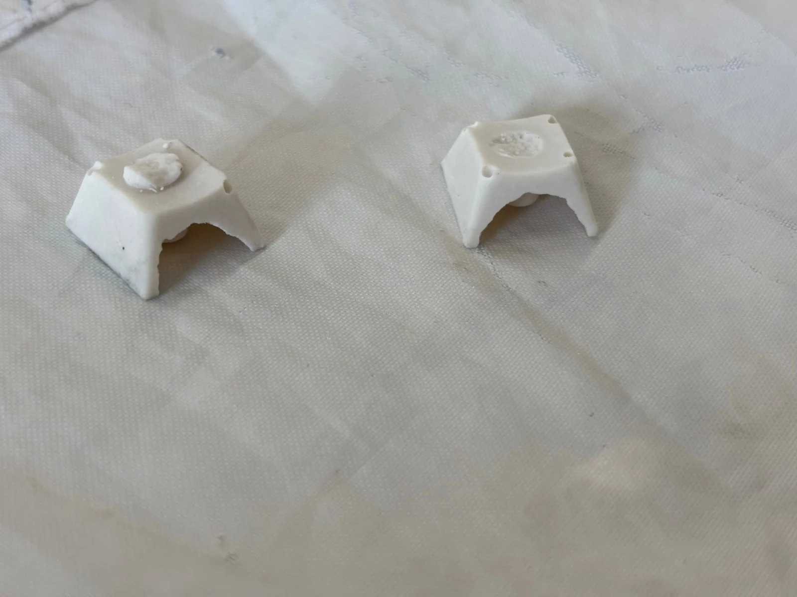
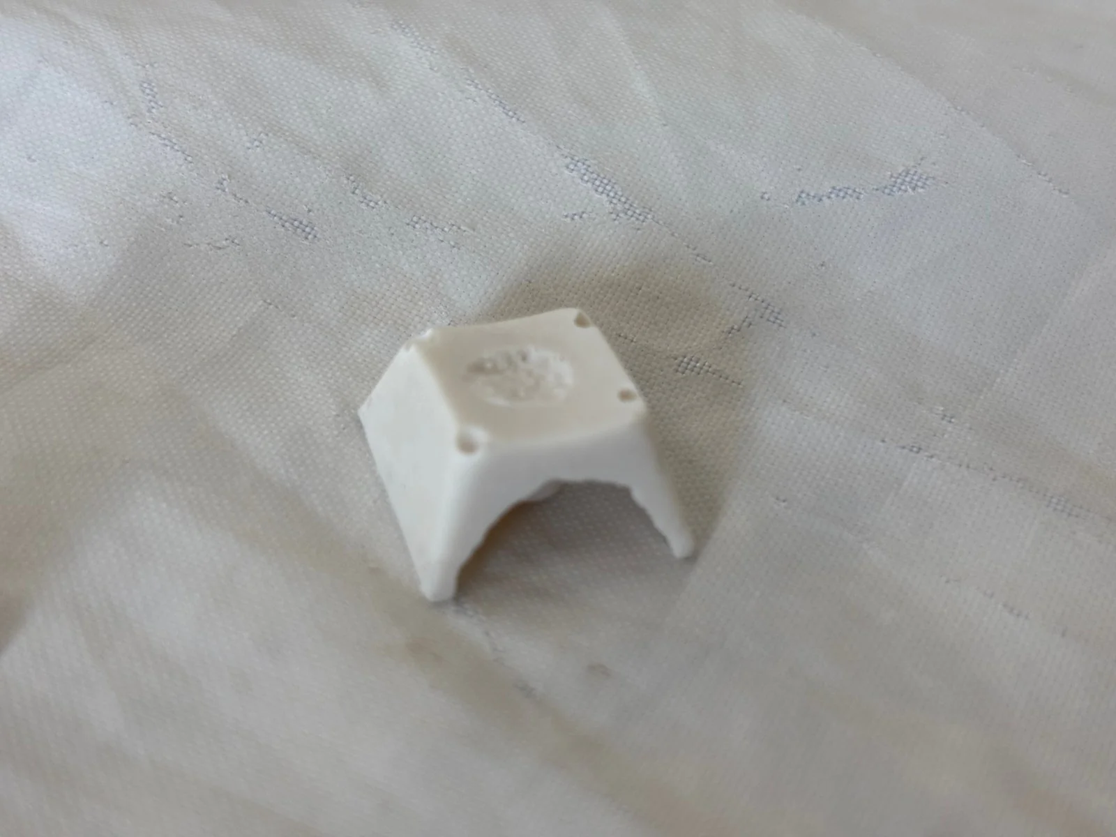
Two-part mould Casting process Cast keycaps before firing

Wall thickness varied with how long the slip sat in the mould before pouring out — the longer it sat, the thicker the wall. That variation was deliberate: a search for the balance between interior space for the switch stem and the strength of the wall. In the end I favoured the thinnest walls that survived firing, since the thicker ones simply didn’t leave enough room inside.

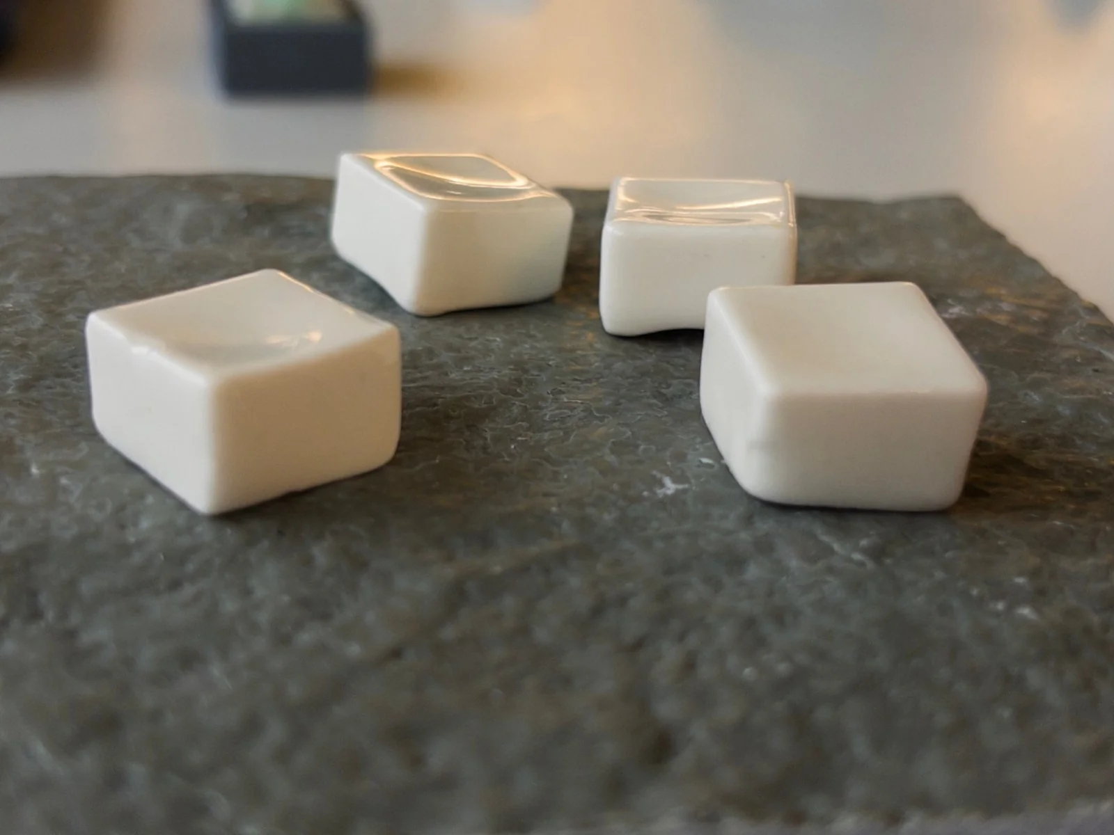
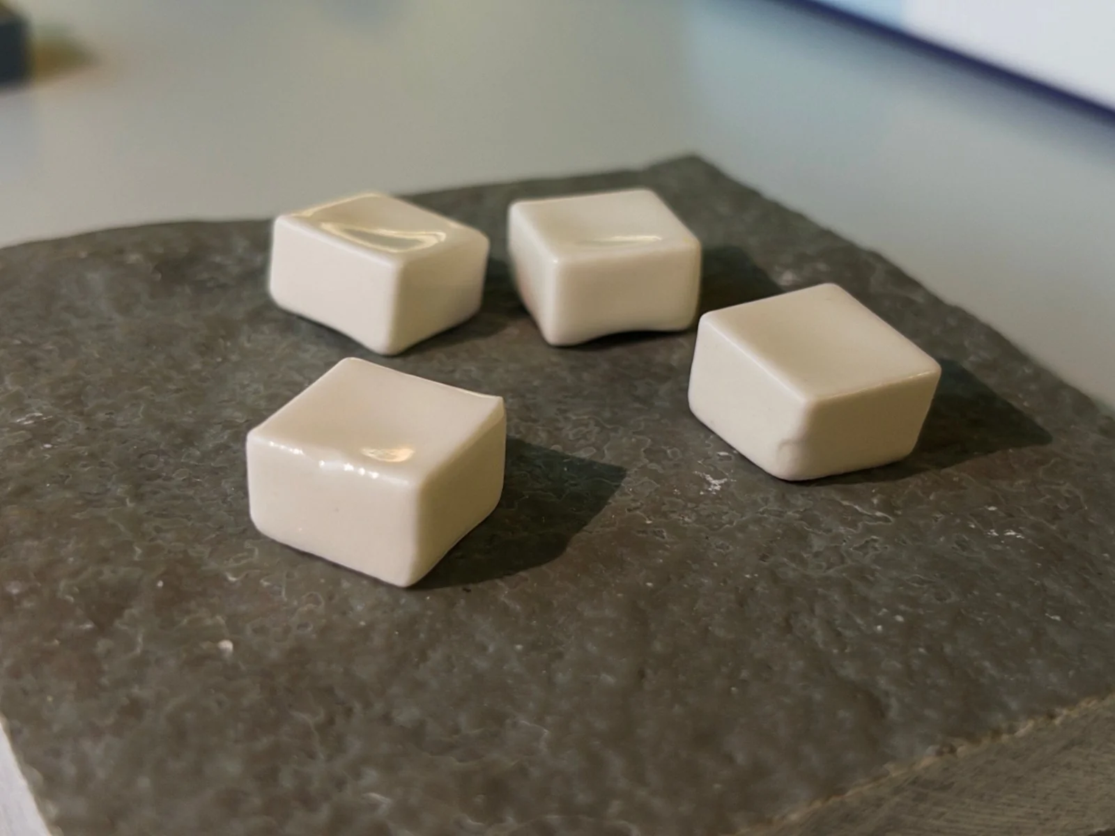
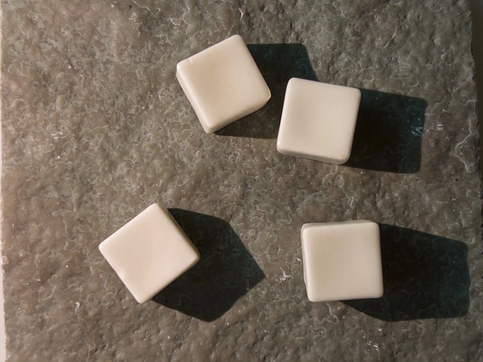
Finished porcelain keycaps Finished keycaps detail Keycaps on a switch

They came out very pretty and feel wonderful to touch. The one surprise was scale: the shrinkage in the second firing — or maybe an illusion of the glaze — left them feeling suddenly smaller than I’d expected.

Raphael Murray-BrowneRaphael Murray-BrowneRaphael Murray-BrowneRaphael Murray-BrowneRaphael Murray-BrowneRaphael Murray-BrowneRaphael Murray-BrowneRaphael Murray-BrowneRaphael Murray-BrowneRaphael Murray-BrowneRaphael Murray-BrowneRaphael Murray-BrowneRaphael Murray-BrowneRaphael Murray-Browne

Table Tennis Bat

Breaking down the distance between users and tools

The aim of this project — my first at university — was to create a table tennis bat, with no concern for practicality or usefulness.

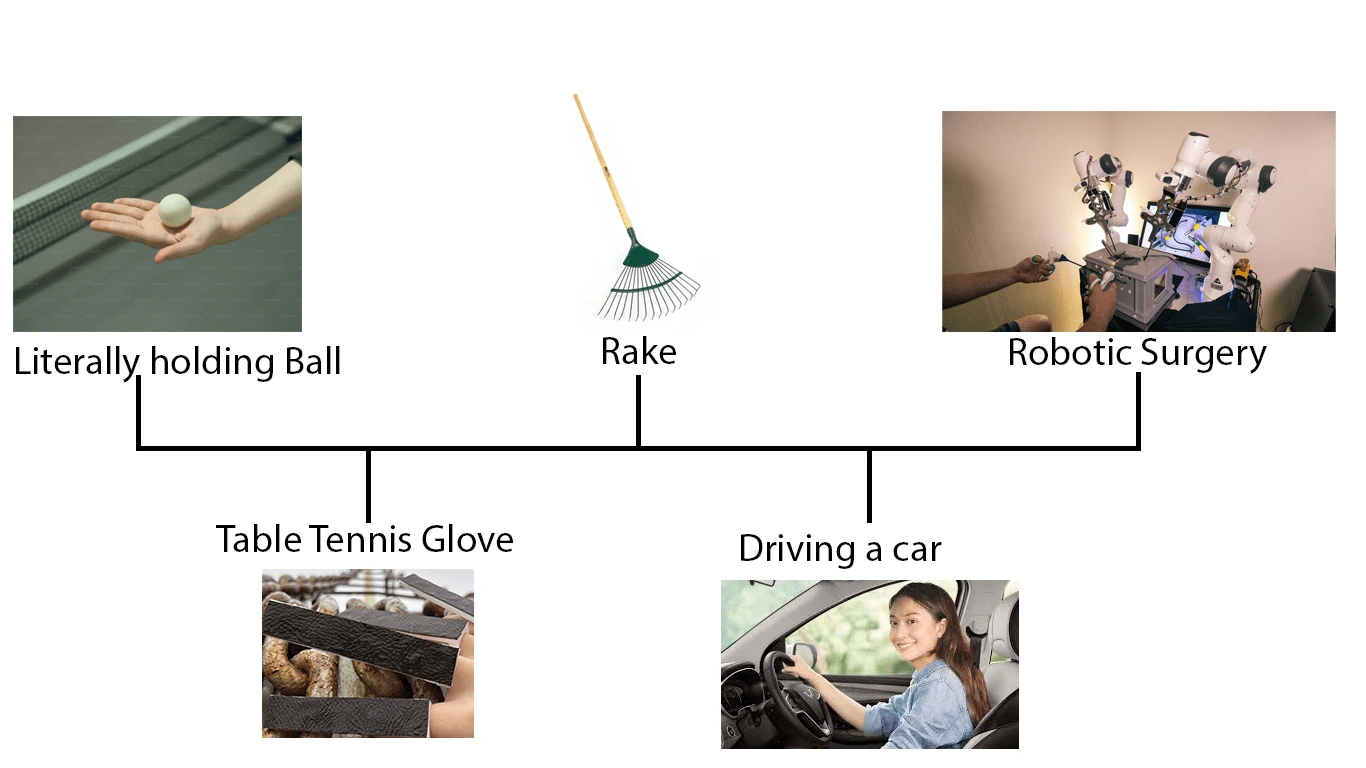
I took the vague brief as an opportunity to experiment with the link between the user and a tool. When a rake is used by a monkey to collect a reward from behind a barrier, the area associated with their hand lights up, as if it has become an extension of its body.

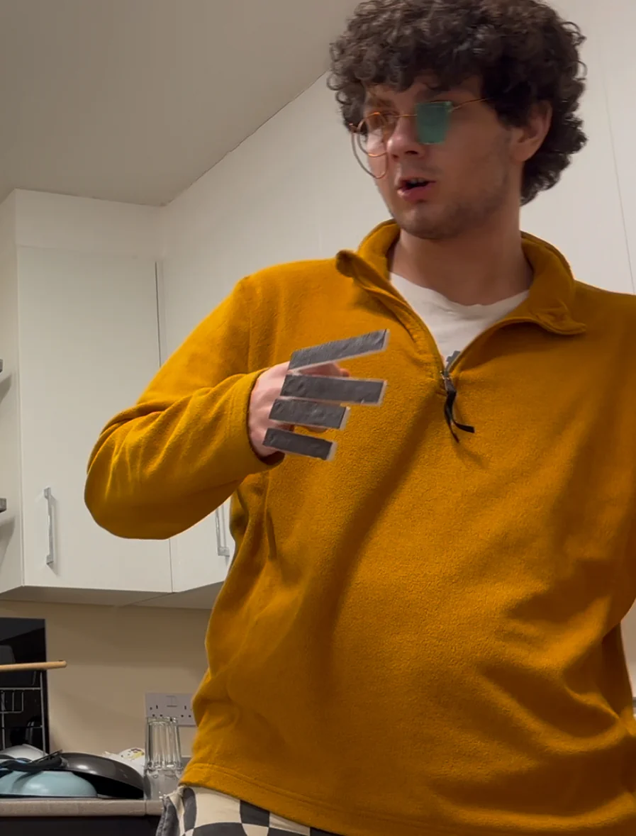
Glove-bat hybrid, worn Bat detail Prototype iteration Prototype iteration

My desire for the Table Tennis Glove, apart from a great way to ease myself into 3D CAD and 3D printing, was for it to narrow the gap between the user and the object. To play into the idea that the tool becomes an extension of the body.

The Table Tennis Glove was a first project I can be proud of. While its build quality could be better, I believe I did well to use the 3D printers for the first time, and came up with a genuinely out there concept. Out of all of the table tennis bats, mine was the only one which didn’t have a clear handle-paddle distinction.

Scale drawing of the bat against the hand
Raphael Murray-BrowneRaphael Murray-BrowneRaphael Murray-BrowneRaphael Murray-BrowneRaphael Murray-BrowneRaphael Murray-BrowneRaphael Murray-BrowneRaphael Murray-BrowneRaphael Murray-BrowneRaphael Murray-BrowneRaphael Murray-BrowneRaphael Murray-BrowneRaphael Murray-BrowneRaphael Murray-Browne

Living Lamp

A lamp that — just like its owner — moves, responds, and evolves.

For my first-year Product Design finale I picked an ambitious brief to stretch my skills — and of every project this year, the lamp is the one I learnt the most from. Before it I’d never touched an Arduino, had only ever built a circuit in a physics class, and had spent almost no time in the metal workshop.

I chose a lamp over another table-tennis bat or wooden catapult because I wanted something I’d actually use, week in, week out — and something in constant use pushes me to make it the best object I can. The brief put provenance — an object’s origin — front and centre, so I started in the library with books on cutting-edge materials like living leather and bioluminescent bacteria. The bigger influence was the then-unreleased game Marathon: its aesthetic of raw, just-out-of-the-factory functionality, and its theme of artificial life, shaped the project more than any single material. I wanted something with undeniable personality — not just another lamp.

Making it move

While discussing the design with Mike, it was suggested I give the lamp movement with an Arduino. I had very little understanding of electronics, but a lamp that moved of its own volition was too appealing to ignore — and my brother, Tim Murray-Browne, a computational artist who works with AI, embodiment and interactive systems, confirmed it was not only possible but doable. So I started small: with a borrowed Arduino and ChatGPT explaining the wiring, I flashed the onboard LED, then powered an external one, then — after mistaking a three-wire servo for a stepper motor — finally got the servo turning. We had movement.

Into the workshop

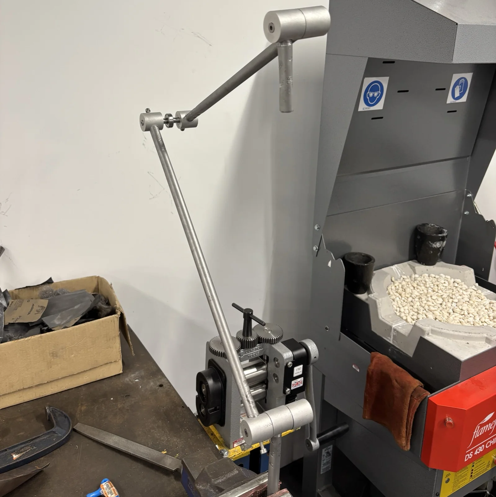
The lamp arm being shaped on a metal roller in the workshop
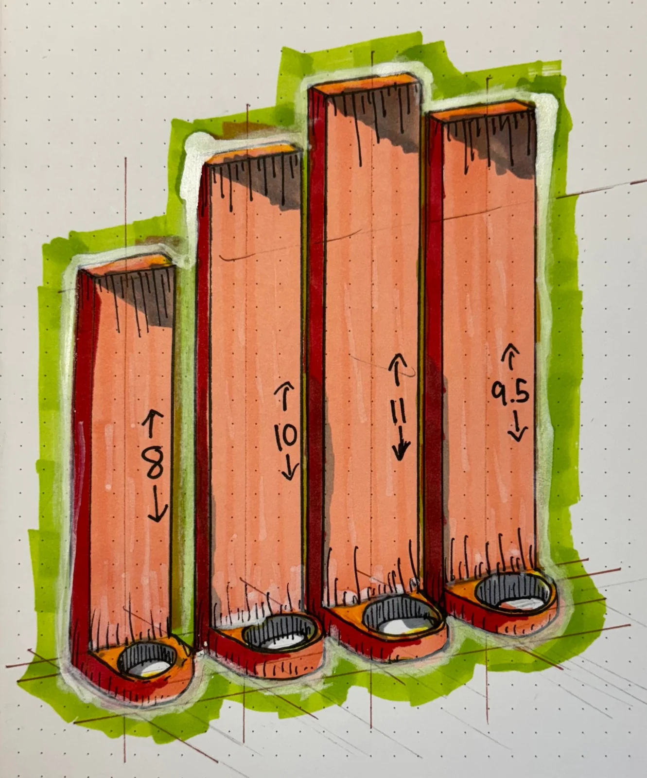
With the electronics proven, I moved on to building the lamp proper, spending most of my time in the metal workshop cutting the aluminium bar and steel pipe. My original plan was to weld the pipe to the bar, but their different melting points made that impossible — so I threaded the holes and simply screwed the pipes in instead.

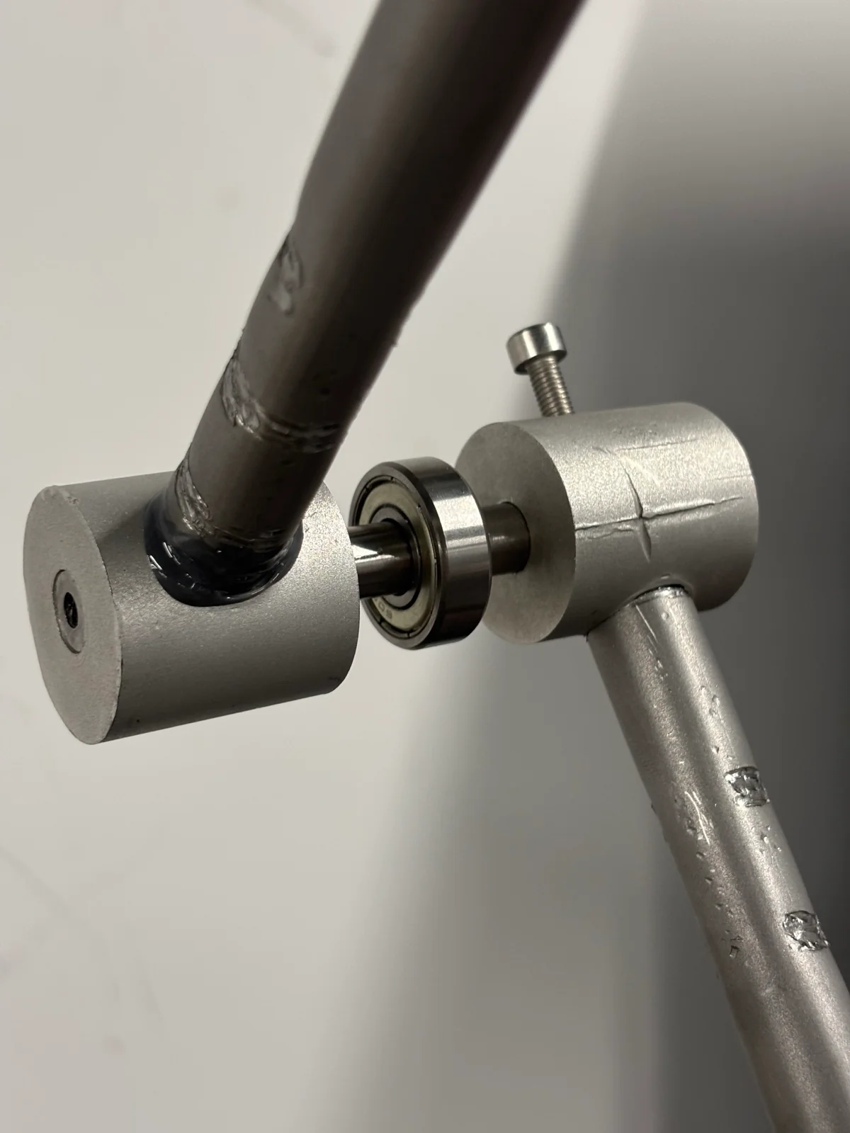
The hinges were the real headache. After consulting one lecturer, two technicians, two books, a company, three different ChatGPT models and roughly ten websites — and after five pages of sketches — I settled on two cylinders rotating on a shared axle, with a bolt pressing a little rubber against the axle for friction, so the lamp holds its position while staying adjustable.

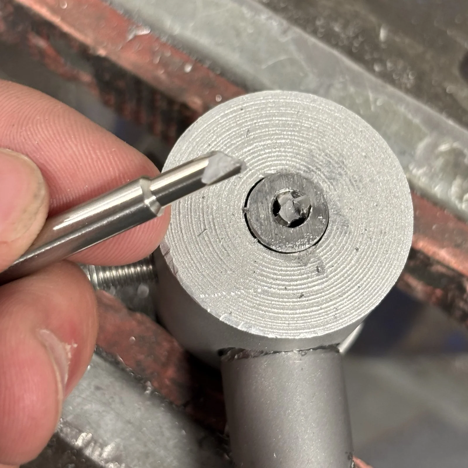
The finished hinge — two cylinders on a shared axle, running on a bearing A tap snapped off deep inside the silver-steel axle
Then the bump in the road. The axle was silver steel — dense, and feeling indestructible — so I threaded it with a regular steel tap. The tap snapped off deep inside, with zero chance of recovery. With no choice but to work around it, I switched to aluminium pipe for the axle, which came with the bonus of a ready-made hole.

Five bases

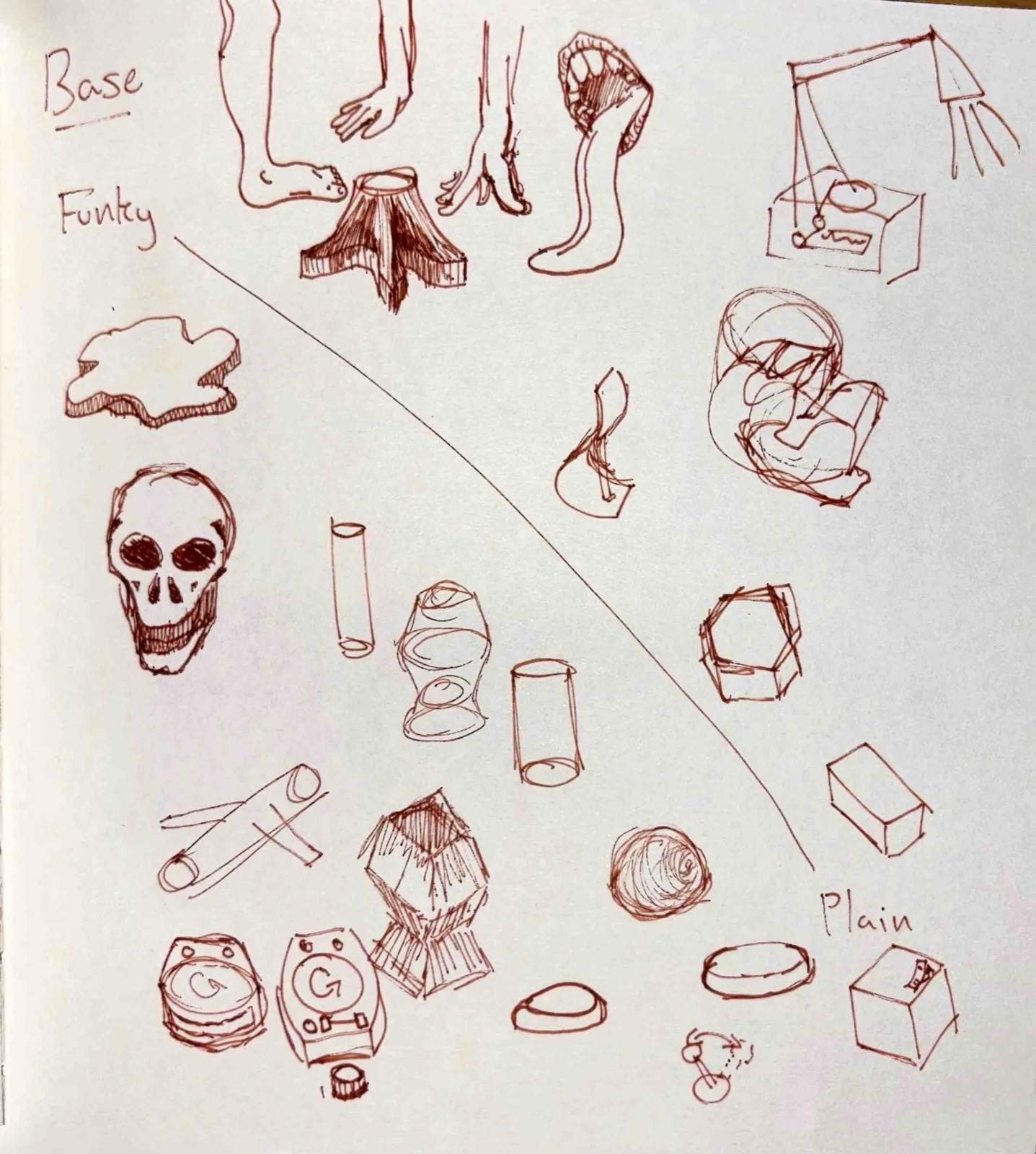
A page of base-form ideas, from funky to plain
The brief asked for five products, and making five of these lamps was never realistic — so the five became five ways to mount one lamp. I sketched everything from the funky to the plain before narrowing it down.

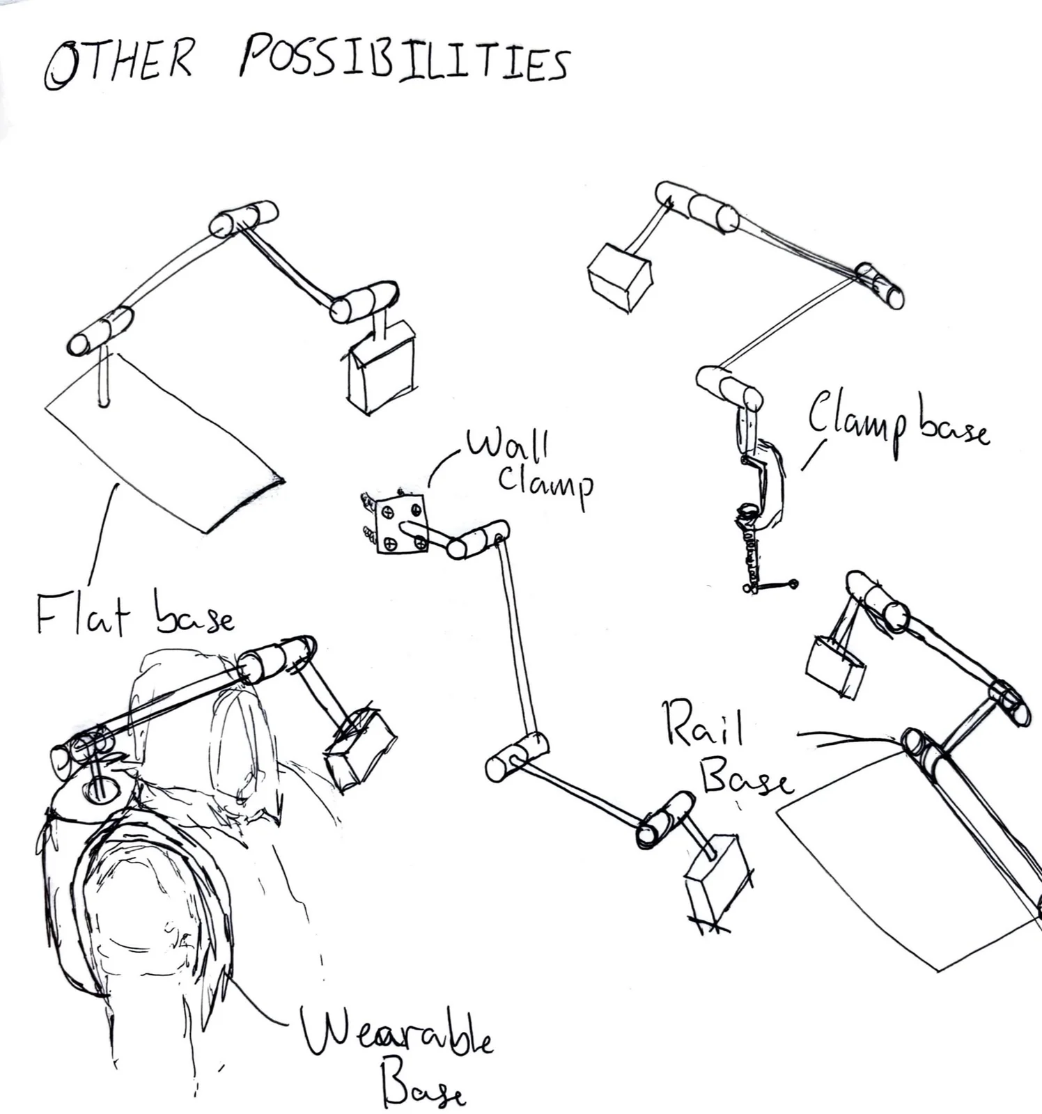
A flat base would have to be impractically heavy; a wall clamp commits you to one position; the wearable base — for paramedics and the like — was a fun tangent; a rail base could run the length of a desk. In the end I went with the clamp: light, easy to set up, and small enough to actually carry around.

Five base concepts: flat, wall clamp, wearable, rail and clamp

What I learnt

I didn’t get everything I wanted. The plan had three phases — a lamp; then a lamp that makes the occasional pseudo-random movement; then a lamp that tracks and follows your hand — and at week 11 of 12, even phase one was looking optimistic. The lamp ended up on a fixed clamp rather than the rotating, gesture-following base I’d imagined.

Even so, it’s the project I’m proudest of. I broke the ice with coding, electronics, mechanical design and metalwork all at once, and came away with real, quantifiable experience in each. The Living Lamp is far from over — it’s become a passion project I’ll keep building well past the deadline, learning robotics and AI as I go, until each lamp can respond to and evolve with its owner.

Raphael Murray-BrowneRaphael Murray-BrowneRaphael Murray-BrowneRaphael Murray-BrowneRaphael Murray-BrowneRaphael Murray-BrowneRaphael Murray-BrowneRaphael Murray-BrowneRaphael Murray-BrowneRaphael Murray-BrowneRaphael Murray-BrowneRaphael Murray-BrowneRaphael Murray-BrowneRaphael Murray-Browne

Smart Jewellery

Designing 'something between a smartphone and a dumbphone' — a set of jewellery that each take on a single phone function, to make it easier to put the phone down.

I was tasked with designing “something between a smartphone and a dumbphone”. The lecture where we learnt of the task was heavily focussed on research and identifying user groups. This seemed like a chore, but only because I’m not yet used to research — and if I am to be a good product designer, then I must be able to identify the people I’m designing for.

I set out to interview a broad range of people — children, young adults, adults and older adults — across different generations and life stages. I wasn’t able to get hold of nearly as many as I originally wanted, but the interviewees — a software developer, an artist and writer, and a composer — were invaluable. The age range wasn’t what I wanted (I don’t have many contacts among the very young or very old), and the occupations were limited to the arts. Not ideal, but working in tandem with outside research, it gave me a pretty good idea of what the market, and consumers, want.

What I asked

The questions I asked were vital, so I worked on a script before any interviews took place. A few of them — and the answers that moved the brief most:

asked & answered

  1. Are there any features of a phone you don't think you could live without? "Maps, some form of free international calling, and the phone itself. Those are the three things." — Dom
  2. What things are holding you back from permanently ditching your phone? "Two-factor authentication — I forgot that as a reason to keep a phone. That's quite hard to ditch." — Tim
  3. Would you prefer for the jewellery to have no interface, or a small interface for interacting with? "If I've got four pieces of jewellery I'd rather use a single interface on my wrist than have them all with their own tiny screens." — Tim
  4. Do you want to be able to use these features, or is it more about being available to certain people? "I'd love to just go for a walk with a clear mind, but not want to be uncontactable or get lost — those are the situations." — Dom

I’ve learnt a lot through this interview process, possibly the most important of which is that I’m no longer just doing things for a school project, or to put it another way: the stakes are higher. I need to be serious and upfront about things like privacy, and making it clear to people what I’m using their image, voice, words, etc. for.

Another thing I’ve found is that it is very difficult to get hold of people outside of my age group, especially those younger than me. The only gen-alpha person I know is my niece, and she is often busy with school and homelife, so organising even a half an hour call with her proved too difficult.

The idea

Thorough online research showed surprisingly few studies about screentime and phone-related anxiety; a couple of the big ones were conducted by the UK Post Office, and another studying teens in India. The Post Office study in particular was the first to coin the term “nomophobia” — the fear or anxiety caused by not having one’s smartphone either on hand, or functioning.

What I had in mind was wearable technology that fills a specific function of a phone, to make it easier for people to part with theirs. I believe the market for this would be expansive, especially as time goes on and screen time continues to rise throughout generations.

Three pieces

The next step was to actually design the products. Three came out of it:

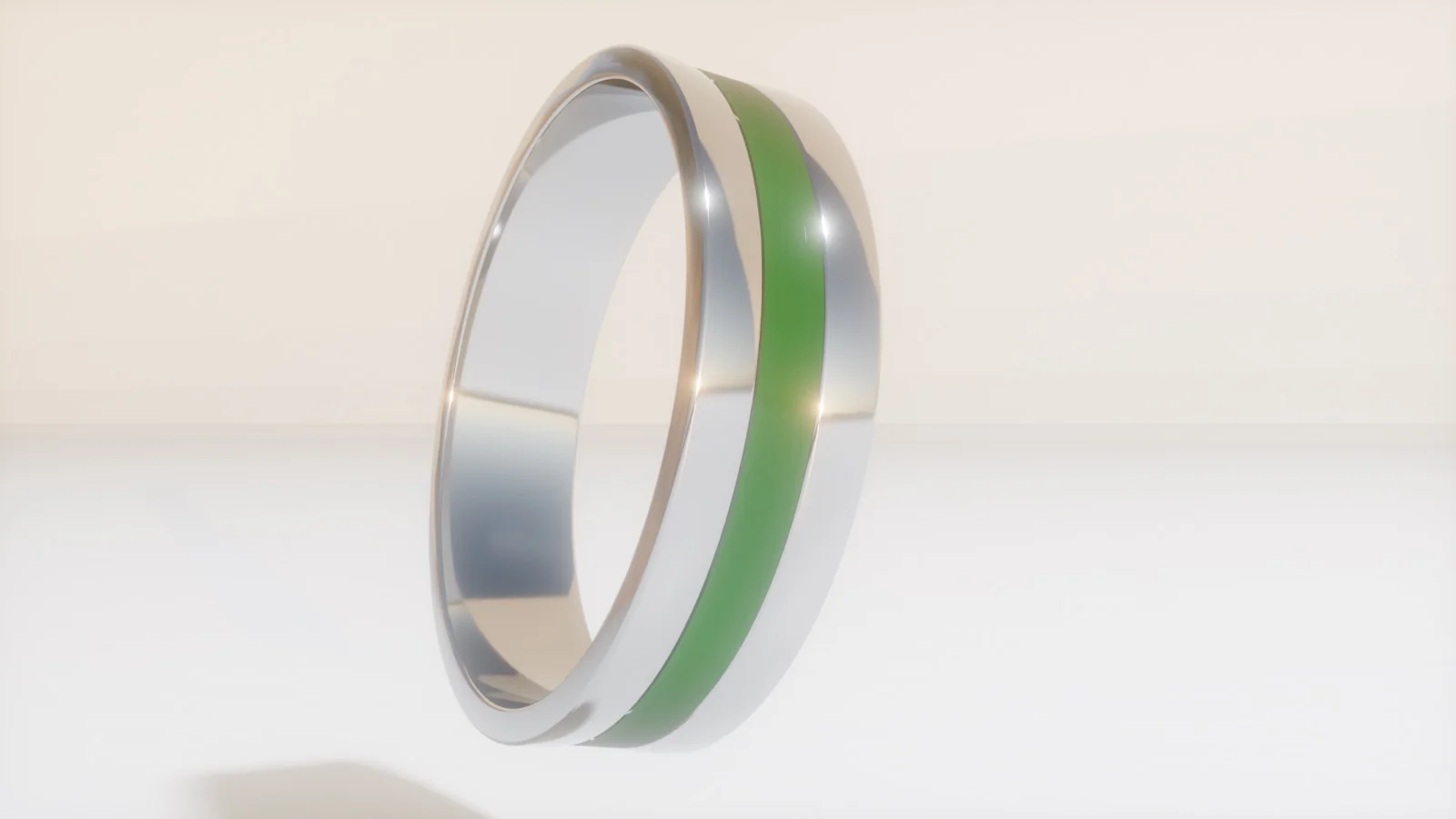
  • A communication ring — I wanted a subtle LED band going through the middle that could glow when receiving or sending a call. I based the dimensions off a ring I wear every day.
  • An AI wristband — the “brains” of the operation: audio in and out, accessing the internet on your behalf, showing map directions on a small 16×16 display (something minimal, such as an arrow and a number), and answering any questions or queries you have. Picture leaving your phone behind but still scanning a restaurant’s QR menu with the camera pendant, then discussing your order with the Large Language Model in the wristband.
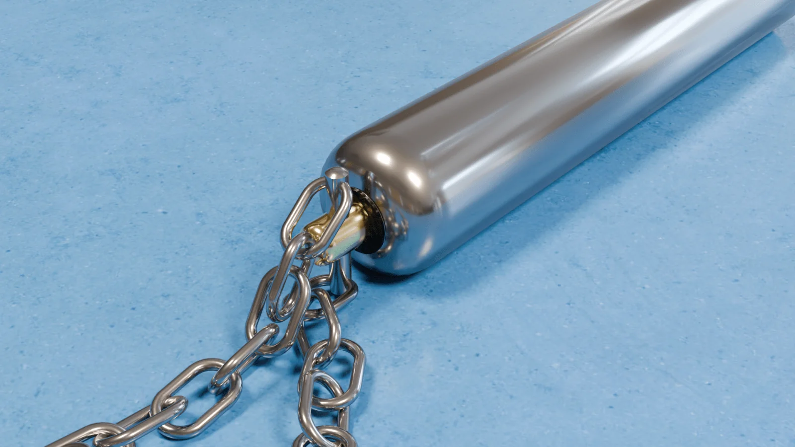
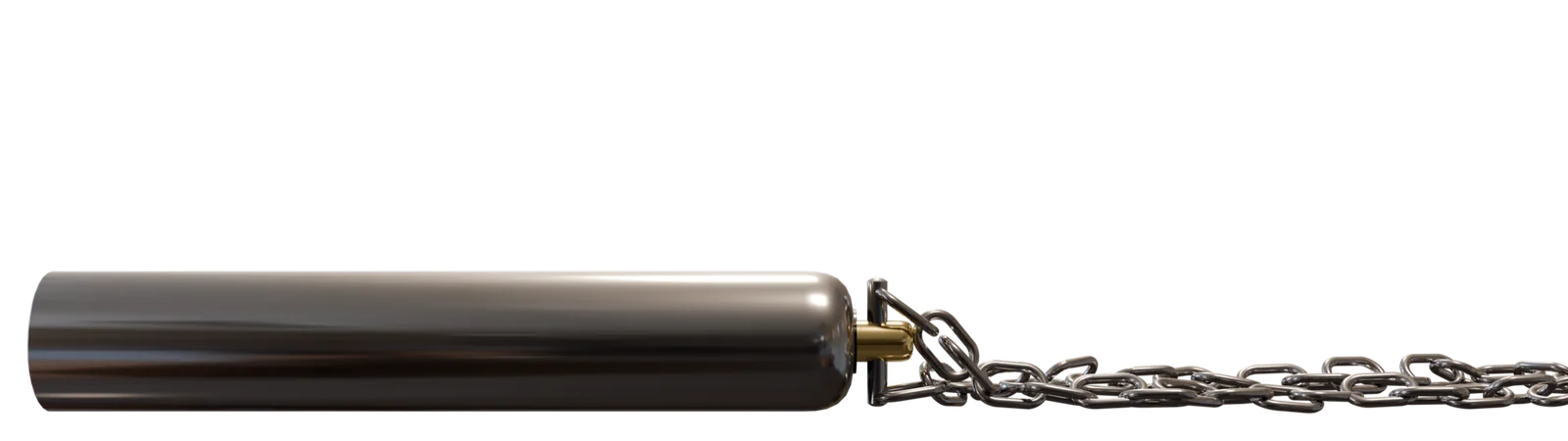
  • A camera pendant — a camera necklace that could rival smartphone cameras, for people who consider constant access to a camera essential. No visual interface, operated by a button that connects to the chain, it sends photos via Bluetooth directly to someone’s smartphone once in range.
Communication ring concept Communication ring, side view Camera pendant concept

I rendered each piece in Blender — its UI for rendering and materials is unmatched by anything else I have available to me.

Camera pendant with its chain laid out

Posters

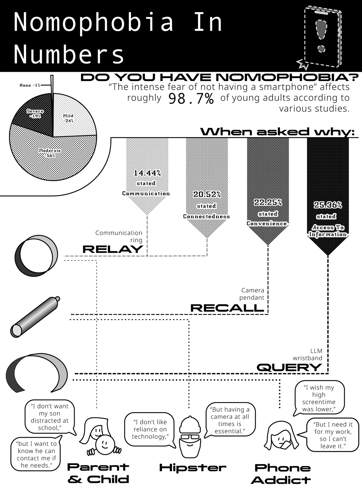
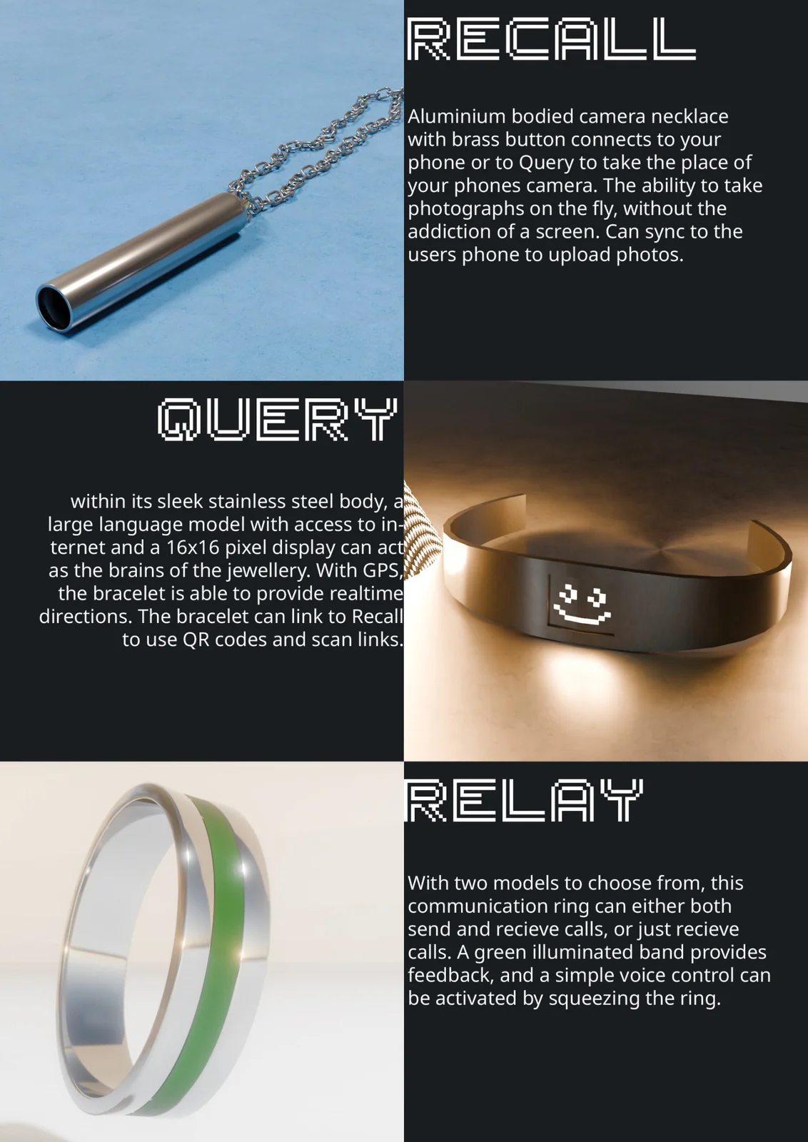
The last step was to present the set, with two posters: a system map showing who each piece is for, and a hero shot to show it off at its best.

System-map poster — who each piece is designed for
The system map was the harder one. I've not much experience with Adobe Illustrator, so this poster was very educational, and I struggled with how to map something like this — in the end I went with mapping out who each product is designed for.
Hero-shot poster of the jewellery set
The hero shot was more rushed, but I think it has just the impact it needs. I gave each of the pieces a fitting name, as well as a description of what it is and does.

Overall I’m happy with how this project turned out, although I do feel I could have stuck closer to the brief. I fear I tunnelled onto the dumbphone aspect, while sidelining the trans-generational requirement — I partially combated this by including a mother and her child as part of the target audience, as well as interviewing a range of generations.

Raphael Murray-BrowneRaphael Murray-BrowneRaphael Murray-BrowneRaphael Murray-BrowneRaphael Murray-BrowneRaphael Murray-BrowneRaphael Murray-BrowneRaphael Murray-BrowneRaphael Murray-BrowneRaphael Murray-BrowneRaphael Murray-BrowneRaphael Murray-BrowneRaphael Murray-BrowneRaphael Murray-Browne

Essays

Three short essays written for my Design Culture module — on anti-consumerism, sustainable futures, and the objects worth keeping.

These three essays were written for my Design Culture module. Read on their own they cover very different ground — Marxism, Solarpunk, a mechanical pencil — but taken together they trace a single thread: a belief in design that resists consumerism and lasts.

What if Karl Marx Designed a Chair?

Karl Marx, best known for critiquing capitalism through the Communist Manifesto, opposed the way capitalism prioritises production above all else. Adam Smith’s idea of task specialisation raised efficiency dramatically — ten workers could produce a thousand clocks a day rather than ten complete clocks if each worked alone.

Marx argued that this efficiency came at a human cost. In his Economic and Philosophic Manuscripts of 1844 he wrote that “the worker is related to the product of his labour as to an alien object.” Factory work stripped craftspeople of creativity and removed the soul from their labour; workers never saw the final form of what they made, and took no satisfaction from it.

A Marxist designer would build chairs through small-batch or individual production, with the same craftspeople involved throughout. Wood would be the ideal material — malleable enough for personal expression — rather than metal, which needs machinery that distances the maker from the object. The design would be simple, functional and likely modular for repair, rejecting the conspicuous decoration that caters to a particular class, and pushing back against planned obsolescence.

Design shapes human behaviour and cultural understanding, which is what makes these choices matter.

Designing a Sustainable Future

Design gives cultural context across human history while shaping how societies behave. Hostile architecture is a pessimistic example of that power; “Solarpunk” is the optimistic alternative.

The Solarpunk manifesto frames the movement as asking “what does a sustainable civilisation look like, and how can we get there?” It embraces technological progress while opposing capitalism, consumerism, artificial scarcity, and short-term thinking about long-term problems. It prioritises renewable energy and green architecture, and asks designers to weigh a product’s broader impact rather than its immediate utility alone.

Aesthetically, Solarpunk pictures humanity living in harmony with nature, supported — not dominated — by technology: wind turbines above people tending fields, in greens, browns, sky blue and chrome.

The honest difficulty is personal reluctance to give up conveniences; real change seems to need mutual commitment. Design is the practical bridge, making a sustainable future feel realistic by shifting how the public imagines it.

My Relationship to the Rotring 600

The Rotring 600 mechanical pencil — almost entirely metal, with a painted steel body and brass components — is a study in longevity-focused design. Its hexagonal form transitions to a cylinder with a fine criss-cross grip, and the weighted construction makes it sit well while sketching.

The grip is comfortable and secure, though its fine metallic texture traps dirt and needs cleaning. Its one real flaw is the small eraser cap, which lodges inside the barrel with nothing to retain it, becomes hard to grip, and is eventually abandoned as a mere cap.

Its greatest value, though, is emotional. Throughout the whole journey of learning to draw, this pencil was constant company. The drawings that got me into university were made with it; it came with me across Western Europe, documenting everything I saw. Longevity-focused products build deeper connections than disposable ones — memories attach themselves to durable objects, which start to work like a journal.

Reflection

The three essays — the Marxist chair, the Solarpunk future, and the Rotring 600 — share an explicit anti-consumerism. Reading them side by side, a personal design manifesto starts to emerge.

I make no claim to expertise in economic theory, but I do hold that people deserve equal treatment, and work driven by passion rather than necessity. Anti-consumerism follows from that: the semi-disposable products flooding the market reach their prices through low wages and poor conditions — the by-product of demanding cheapness without regard for quality or durability.

Longevity is the constructive half of the same idea. Well-made objects last longer and serve better; the higher up-front cost pays back by never needing to be replaced, and the longer you keep something, the more the design has a chance to earn its keep.
Raphael Murray-BrowneRaphael Murray-BrowneRaphael Murray-BrowneRaphael Murray-BrowneRaphael Murray-BrowneRaphael Murray-BrowneRaphael Murray-BrowneRaphael Murray-BrowneRaphael Murray-BrowneRaphael Murray-BrowneRaphael Murray-BrowneRaphael Murray-BrowneRaphael Murray-BrowneRaphael Murray-Browne

Topography Table

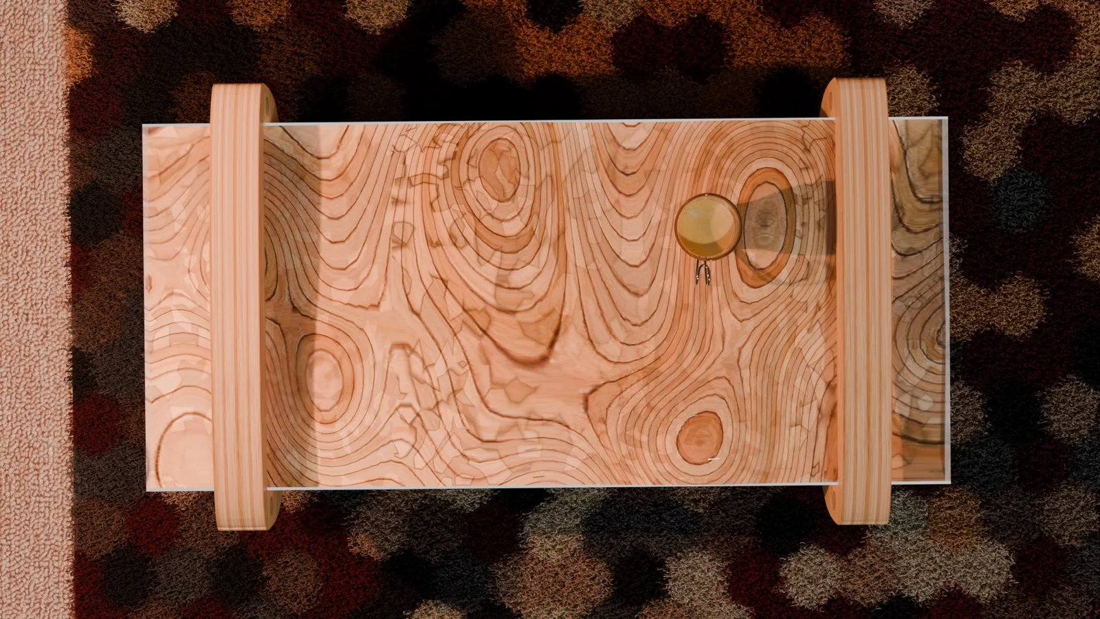
A low table whose layered-wood top reads like a contour map, sealed flat under a clear top — a personal CAD-and-render study.

A personal furniture study. The tabletop is built up from stacked layers of wood, so the grain and the steps between layers read like the contour lines of a topographic map. A clear top then seals the landscape flat, turning a relief you’d normally only look at into a surface you can actually use.
I modelled the table in Rhino and rendered it in Blender, dropping it into a living-room scene to test how the piece sits in a real space — the layered top against a patterned rug, with soft daylight raking across the steps to catch the level changes.

Bird's-eye view of the table — the layered-wood top reading as topographic contours under a clear surface
Raphael Murray-BrowneRaphael Murray-BrowneRaphael Murray-BrowneRaphael Murray-BrowneRaphael Murray-BrowneRaphael Murray-BrowneRaphael Murray-BrowneRaphael Murray-BrowneRaphael Murray-BrowneRaphael Murray-BrowneRaphael Murray-BrowneRaphael Murray-BrowneRaphael Murray-BrowneRaphael Murray-Browne

CV

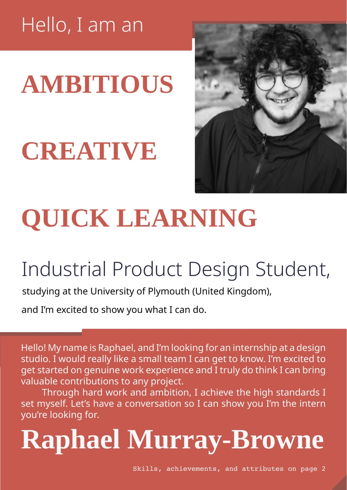
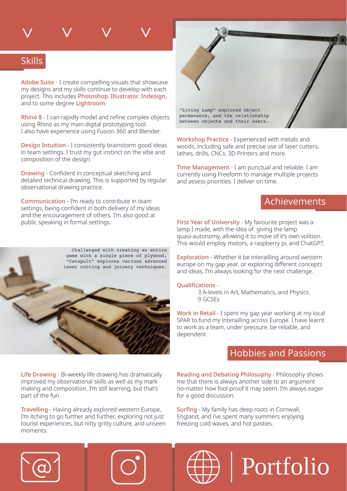
My two-page CV — a snapshot of my skills, achievements, and what I'm after. Download the PDF, or read it below.

Download CV (PDF) CV page one — introduction and personal statement CV page two — skills, achievements, hobbies and contact